Digital map-maker Eric Fischer is at it again! 511CC previously highlighted a fascinating, Twitter data driven map Fischer had created that clearly showed the majority of people tweeting about BART are riding BART. This time we would like to share more compelling and intriguing data Fischer has put into digestible map format. All images below are from Eric Fischer’s Flickr page.
Pedestrian Mode Share on the way to East Bay BART Stations
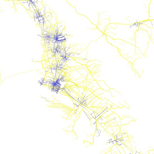
- The blue lines represent where almost all people on their way to BART are walking. Yellow lines show where almost all BART passengers are on bikes, on transit, or in cars.
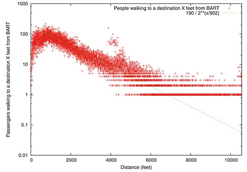
Number of People Who Walk Various Distances from BART
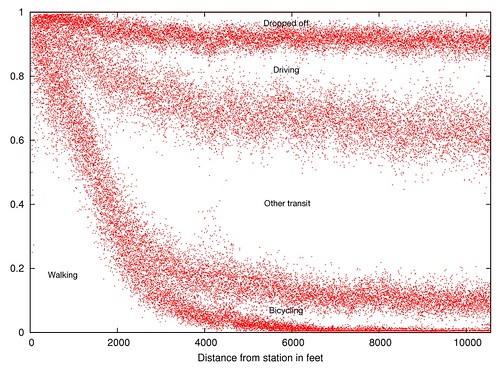
How BART Riders get to the Station, By Distance
BART Pedestrian Origin Outliers
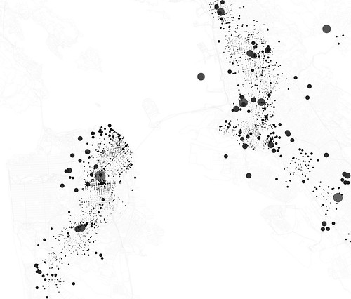
- Dot size is the number of people who walk to BART from there, divided by the overall likelihood of walking that far. The larger gray dots are just so you can see the smaller dots they overlap with
See more interesting transportation maps and pictures on Eric Fischer’s flickr page. And if you’re interested learning more about Fischer’s data maps, check out this interview with him in the SF Gate.