Chances are you have probably glanced at BART’s schedule, which looks like this…
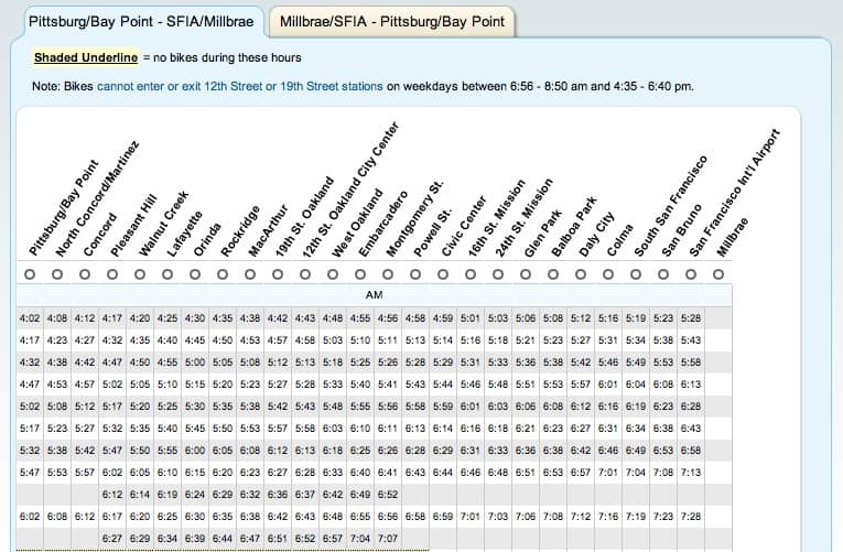
Pittsburg/Bay Point Schedule. Screen grab via: BART
But what would you saw a BART schedule that looked like this?…
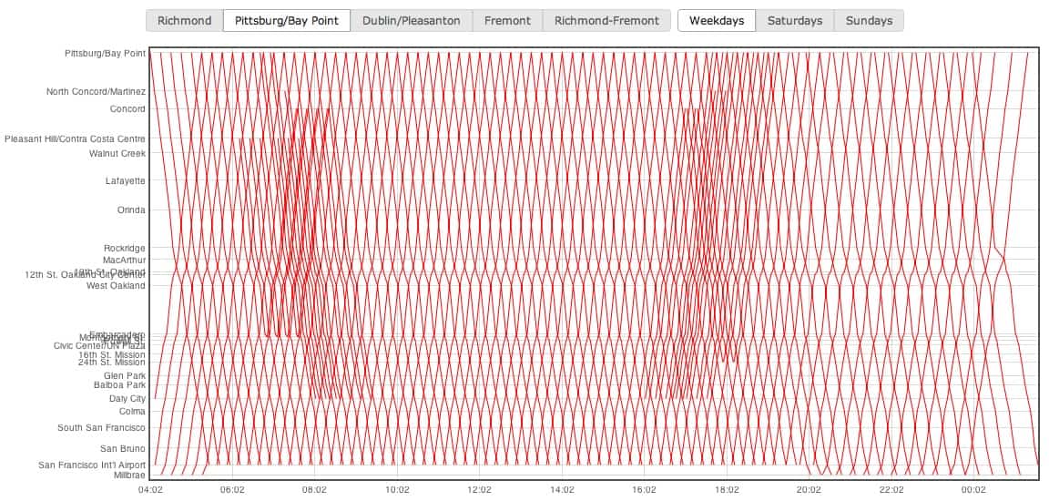
This is the Pittsburg/Bay Point Schedule, but in a different perspective– click image to interact with it. Screen grab via: http://andrusia.com/visualtrains/
The above series of red lines, looked at in conjunction with the X and Y axis, actually correspond with where the Pittsburg/Bay Point BART train will be at a given time. The graph is a visualization of the BART schedule based on an 1885 schedule of the paris-lyon railroad reprinted in The Visual Display of Quantitative Information by Edward Tufte. Click onto the image above to hove over a stop and see what time BART will arrive at a stop.
Even Flickr user extraordinaire Eric Fischer has created Tufte inspired visualizations of BART schedules

Image credit: Eric Fischer
For more about Edward Tufte’s method of visualizing data, check out this article on Drones that also shares similar graphic visualizations of BART schedules. Here’s an excerpt:
[Tufte] has published a series of books on visual representations and presentations of data, with an emphasis on getting the information across rather than prettyfying it with useless graphical distractions like you see in USA Today and similar magazines.
One of the techniques presented in the first book (“The Visual Display of Quantitative Information”) is the railway timetable first published by E. J. Marey in 1885. In one simple graphic it presents an amazing amount of information.
What do you think of this method of seeing data?