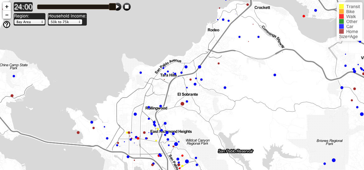
(A still of commute patterns in the East Bay. Screen grab via: Activemaps)
Data is an empowering and effective tool for better understanding our everyday lives, and when that information can be easily digested through visuals we are all the more grateful. With this in mind, a thank you is due to UC Berkeley planning Ph.D. student Fletcher Foti, who recently compiled commute patterns in greater New York, Los Angeles, and the San Francisco Bay Area, and created an interactive visualization called “Active Maps.” Active Maps shows a day of travel from recent travel surveys and can be sorted by income and zoomed to specific areas. Each circle represents a person, and the size of the circle represents the age of the person. When looking at the East Bay, it’s interesting to note regardless of income, transit and walking appear to be most prevalent around Berkeley and Oakland whereas the surrounding parts of Alameda and Contra Costa County appear more car-dependent.
For additional coverage, visit The Atlantic City and San Francisco Streetsblog.
*(Note: the default map is for New York, though you can click on the drop-down bar to select the San Francisco Bay Area)