maps | 511 Contra Costa

Freeway Maps as Public Transit Corridors

Metro Rail and Liner Map - Spring 2012

A map of Los Angeles’ current rail network. Image credit: Kriston Lewis

Los Angeles is being hailed for its steady revival of the thriving rail system it once had, but the current plan to create a convenient network that connects the whole county is still 30 years away.  The Los Angeles rail system has seen rapid growth in usage with the most recent addition, the Expo Line, which was completed earlier this year.
Now, let’s imagine what the freeway system in L.A. would like like if  it was a rail system?  We have an idea thanks to “Stonebrown Design,” who has put together maps of L.A.’s freeway system as though it were a rail system:

LA Freeway Map

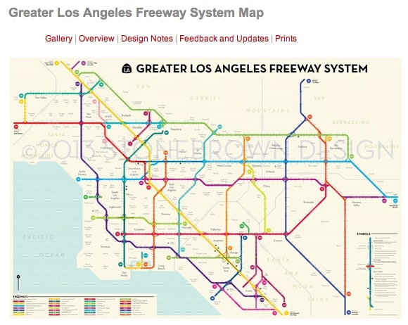
Los Angeles’ freeway system, seen in rail map form. Screen-grab via: Stonebrown Design

Comparing the above Stonebrown Design map to the current Metro Rail map there is a clear visualization demonstrating that rail doesn’t serve as many people as the freeways do (yet!).

To see more detailed maps of L.A.’s freeways with a “public transit vision,”  head over Stonebrown Design’s Greater Los Angeles Freeway System Map page (soon you’ll be able to purchase prints as well, due to a rather successful Kickstarter campaign).

Vintage 1976 BART Map

BART. The world’s most sophisticated rapid transit? Bay Area map maker and enthusiast Eric Fischer recently uploaded this 1976 BART brochure touting how its 2,000 employees care about its passengers.

Over, Under, and Around San Francisco (1976)
(Click to enlarge)

The brochure text is reads:

“BART invites you to join us on the  world’s most sophisticated rapid transit. BART is a space age transit system with over 2,000 people who care about you and it’s the most convenient way to get over, around, and under the Bay Area in minutes.”

The brochure goes on to describe how to access BART and the cost of parking at BART stations (which was free with the exception of the Lake Merritt Station, which would set you back 25 cents per day). Another interesting detail that emerges is in the text the portion about bikes on BART. While all bike restrictions have now been lifted, when the system opened you needed a temporary permit from a station agent to bring your bike on-board during certain hours.

Be sure to check out some of our other posts highlighting the early days of BART, plans that never happened, and what lies ahead.

(For all BART related posts, click on our “BART” tag.)

Visualizing Bay Area Commute Patterns

ActiveMaps
(A still of commute patterns in the East Bay. Screen grab via: Activemaps)

Data is an empowering and effective tool for better understanding our everyday lives, and when that information can be easily digested through visuals we are all the more grateful. With this in mind, a thank you is due to UC Berkeley planning Ph.D. student Fletcher Foti, who recently  compiled commute patterns in greater New York, Los Angeles, and the San Francisco Bay Area, and created an interactive visualization called “Active Maps.” Active Maps shows a day of travel from recent travel surveys and can be sorted by income and zoomed to specific areas. Each circle represents a person, and the size of the circle represents the age of the person. When looking at the East Bay, it’s interesting to note regardless of income, transit and walking appear to be most prevalent  around Berkeley and Oakland whereas the surrounding parts of Alameda and Contra Costa County appear more car-dependent.
For additional coverage, visit The Atlantic City and San Francisco Streetsblog.
*(Note: the default map is for New York, though you can click on the drop-down bar to select the San Francisco Bay Area)
 

Bay Area Transit Vintage Goodness

TransitMaps
Transit connection map from 1981, still in use after more than 30 years. Screen grab via: TransitMaps
The Transit Maps tumblr  recently highlighted the above photo taken by transit rider Alex Jonlin of 1981 transit map he spotted in the Fremont BART Station. Jonlin, comments on the map:

I saw this at the Fremont BART Station a couple weeks ago. It’s labeled (in tiny print at the top) “September 1981.” I have no idea how it ended up staying for so long, but it’s interesting to see how the transit system has changed since then. I also like the concept of depicting long-distance rail and long-distance buses just about the same – it shows people that the Bay Area’s transit network extends beyond where just the BART and Caltrain go.

Now whether the fact that the map is still in use several decades since it was made is a good thing or a bad thing you can decide for yourself. The style of the map remains rather stylish but if you need a transit map that’s a little more current, feel free to check out our Contra Costa Transit Map page.

Map: All Subways of North America

NA Map
A glimpse of xkcd’s map of all subways in North America– click the above image to see the full map. Image credit: xkcd
Here’s one for the rail and public transit enthusiasts– xkcd recently shared a cool map displaying all subways in North America, connected. For the die-hard rail enthusiasts, xkcd does offer this disclaimer:

The definition of a subway used here is, with some caveats, “a network containing high capacity grade-separated passenger rail transit lines which run frequently, serve an urban core, and are underground or elevated for at least part of their downtown route.” For the rest of you, the definition is “an underground train in a city.”

It’s a fascinating map nonetheless, regardless of your definition of “subway,” check it out!
(Previously here at 511 Contra Costa we’ve also shared a similar map for bicycles that ties together bike routes across the nation into a network, known as “United Bike Lanes of America.” For more interesting transit maps, check out our posts tagged “maps.”)

A Map of California Rail (2013)

california rail map
Bay Area rail lines– more extensive than you thought, huh? Screen grab via: California Rail Map
It’s not hard to access a map of California’s highway system– from google maps to regional maps, highways are visible and this comes as no surprise. What is surprising however, is that it is only now has someone compiled a map of California’s extensive (and growing) rail system.
The team at California Rail Map has put together a map of California featuring:  Amtrak, BART, Muni, VTA, Caltrain, Altamont Commuter Express, Sacramento Regional Transit, NCTD, San Diego Trolley, LA Metro, and Metrolink (in addition to key bus and ferry connections between rail services).
The end result – a rather impressive map – highlights many possible ways to explore California’s gold, car-free!
For more information, head over to California Rail Map’s website.  And rail enthusiasts who just can’t get enough, make sure to check California Rail Map out on facebook for more impressive maps, infographics, and conversation about high-speed rail.
Oh yeah, and don’t forget to download your own California Rail Map.
 

Seeing One Day in San Francisco Through Transit Activity

San Francisco is full of hustle and bustle. Have you ever wondered what that looks like through the eyes of public transit?
Youtube user SLT Transit put together a time-lapse video of transit activity over a typical day in San Francisco that demonstrates through its mesmerizing patterns how vital public transit is to city’s transportation system. Check out the video below:

Recognize your bus route? Video credit: SLT Transit

Subway System Maps of the World Scaled to Same Size

For decades cities around the world have been implementing subway systems to accommodate speedy, convenient travel across metropolitan areas. Some systems are world famous like London’s Tube network, and New York’s subway system.
But did you know, if scaled to the same size, the Bay Area’s very own BART system is larger than both of these systems?

BART System Map
Photo credit: TJ Perez

Fake is the New Real recently compiled subway system maps from around the world, scaled to the same size and BART is larger than both.
In fact, BART’s network is the largest of all the subway systems featured, larger than other subway system heavy-weights like Berlin, D.C., and Shanghai!
While the size of a subway system does not dictate quality the comparison is impressive.
Check out the 45 subway systems featured over at Fake is the New Real.

The United Bike Lanes of America!

So you’ve mapped out a bike route for your work commute, but what about making one for bicycling across the country? If you’ve ever considered taking a bicycling road trip to travel state to state you needn’t worry–  GOOD and Gregory Hubacek, in partnership with CLIF Bar have already got you covered!

That’s right, they’ve mapped out a national network of bicycle routes (pictured left) and as The Gaurdian reports, the map includes urban and rural routes in addition to additional details like the total number of bike lanes in major cities.
 
Behold, the United Bike Lanes of America! Image credit: GOOD
Head over to The Gaurdian for additional coverage and the GOOD infographic to see a full sized map of bicycling routes and start planning your cross country bike trip!

A "Glowing" View of Bay Area Transit

Things are looking bright for Bay Area transit with record high ridership, but if you really want to see a glowing view of the agencies serving the Bay, look no further.  The map below was created by deviantART user DylanofTilden.

 The Bay Area, through public transit lines. Image credit: DylanofTilden

According to DylanofTilden what started as an attempt to map San Francisco through public transit ballooned into the map that you see here. Be sure to check out the SF Weekly’s coverage and a larger size of the impressive, artistic map as well!

Amazing Maps of Bay Area

If you’ve ever taken BART to get anywhere, you’ve probably seen the most common map of the Bay Area– that displaying the iconic transit system’s network. But have you seen the Bay through the fascinating map filters of the region created by the San Francisco based Stamen Design? Stamen has developed three amazing ways to see the Bay:
Toner…

“These high-contrast B+W (black and white) maps are featured in our Dotspotting project. They are perfect for data mashups and exploring river meanders and coastal zones. Available in three flavors: normal, no labels, only labels.”

…Terrain….

“Orient yourself with our terrain maps, featuring hill shading and natural vegetation colors. These maps showcase advanced labeling and linework generalization of dual-carriageway roads.”

…. and Watercolor

“Reminiscent of hand drawn maps, our watercolor maps apply raster effect area washes and organic edges over a paper texture to add warm pop to any map.”

The pictures above are just stills, so if you want to see more go ahead and check out the cool, interactive maps yourself!

Bay Area Fantasy Transit Maps

Smart phones are of great help when taking transit, offering specific transit apps, gps, internet access… However, despite the seemingly ubiquity and practicality of smart phones for such trips it is difficult to replace the accessibility and simplicity of well-designed transit maps. Recently The Atlantic Cities took a look a couple of ‘fantasy transit maps‘ created by Brian Stokle that show “how a single, unified transit map might provide greater accessibility and ease of use” with hopes to “stimulate conversation about how transit decisions are made”.
Stokle used five criteria in determining how to create his easy to read, unified maps of Bay Area transit, including:

Focus on the customer’s needs, especially those who are new to transit (new commuters, tourists, visitors, etc.) and for locals unfamiliar with how to get to a certain part of the Bay Area.

and

Show only frequent, fast, and reliable transit, principally rail transit. Rapid bus routes were also included because they are fast and frequent as well. Some other transit was shown for reference (e.g. peak period commuter rail, trunk bus lines where no rapid transit exists) but showing every bus line would have been too confusing and unhelpful.

See below Stokle’s map of all current, and under construction projects that meet his criteria.
SPUR Regional Transit Map Current
Credit: Brian Stokle
The article is an interesting read, contemplating how to strike the most user-friendly balance between schematic and geographic mapping and proceeding to share what a unified transit map of all existing, planned (but may lack commitment, funding) and some additional suggested lines that meet Stokle’s five criteria may look like. Hop over to The Atlantic Cities and give the article a read.
 

1896 Bicycle Map of California


What a blast from the past!
Did you know Californian’s were already biking across the state as early as 1896? As we discuss in our History of Transportation – Bicycles, more efficient and precise manufacturing technologies allowed bicycles to be made cheaply, more safely, and they proliferated!
Bicycling was so common, it made people realize the impracticality of corsets. In 1896, Susan B. Anthony said that “the bicycle has done more for the emancipation of women than anything else in the world.”
See the full sized version here.

Where is BART?

One cool thing about knowing BART arrival times (other than how long you have to wait until the next train), is seeing those trains move along the system in real time.

Meet WhereISBART.com.
Have you ever wondered how many trains were in the BART system at a given time?
Or, how far away is that next train, really?
Or, if my friends boarded BART at another station a few minutes ago, will I meet them on this train that’s arriving now?
Where is BART? updates every 15 seconds to show where your train is throughout the Bay Area.
What more details? Click on any station for arrival times to that station, or browse arrival times the old-fashioned way on BART’s website.

1913 Transit Time Isochron Map for the Peninsula and East Bay

Ever wonder what commutes were like from the Peninsula and East Bay to San Francisco in years gone by? The folks at Burrito Justice pointed our attention to this neat 1913 transit time isochron map for the Peninsula and East Bay to 3rd and Mission for ferries and trains (steam and electric). To see additional transit-related documents from earlier years, take a glance at Eric Fischer’s Flickr page.
Here is the text included at the side of the map:
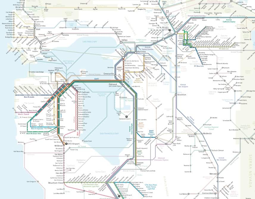
While practically half of San Francisco lies within the 30-minute time zone, none of the trans-bay commuters now reach land within that time. All of the trans-bay districts are reached within an hour, the same as San Francisco. But for the former, from one-fourth to one-half of the time is consumed in the water trip. Shaded contour areas and time points within circles indicate how far commuters may ride within 10-minute intervals from the center of the business district-Third and Market Streets (allowing seven minutes to the Ferry terminal, and 10 minutes to the railroad terminal at Third and Townsend Streets). The inner shaded zones correspond to the running time by electric and cable lines. Double circles and the Peninsular zone particularly refer to steam lines. Running speed is indicated directly by the relative distance between these time points. For steam trains, the time shown is on limited local trains passing by only the less important stations. Some limited expresses make 26% better time, and way locals 15% slower time than here indicated. With the same character of rapid transit equipment, it appears that from 20 to 30 minutes more running time will always be necessary, by reason of the water trip, for trans-bay commuters to reach their homes than for San Franciscans, but that no such handicap exists as a limitation for Peninsular development.

San Francisco Bay Area Rapid Transit District General Map from February 9, 1961

Recently, we stumbled upon a 50-year old map of the BART system from 1961, more than a decade before it began operation. Remarkably, the map is very similar to the system that was eventually built and is running today, but without the extensions to Palo Alto and Novato:

[Photo via Eric Fischer]

For comparison, here is the current BART system map as of March 25, 2010:

[Photo via BART.gov]

To see the original old BART map and others, visit the San Francisco Public Library History Room (6th floor) vertical files, “SF Transportation / Rapid Transit / BART / Maps” or view Eric Fischer’s photos on Flickr.
For more information, visit BART.gov or read about BART on Wikipedia.

Biking directions added to Google Maps

Yesterday, Google announced it had added a new biking feature to Google Maps. When a user needs directions for getting from Point A to Point B, they can now select ‘Bicycling’ in addition to ‘By Car’, ‘Walking’, and ‘By Public Transit’. From the Associated Press:

Google spent the past six months tweaking its mapping service so it could recommend routes that would steer bicyclists away from big hills and heavily congested streets.

You can see trails and bike lanes directly on the map, as well as drag and drop points to customize your route.
Here is a short video on how to use the new feature:

Source:

Real Time BART arrival info now on 511cc maps

We’ve added a new map that shows estimate positions of BART trains based on real time arrival data.Where Is BART.
Train positions are estimated based on the data that BART provides. Our map is great for visualizing the system and checking when the next trains are estimated to arrive. BART also provides arrival predictions on their website, if you choose a station you get a page full of useful info about that station, for example see the page for Pleasant Hill.
» Where is BART? real time location prediction map

Contra Costa Times features our bike locker map

View Bike Locker MapA short article in the Contra Costa Times highlighted our bike locker map.

“In a new feature of the site supported by the Contra Costa Transportation Authority, Web users can get information about the lockers by navigating to the Web site, clicking on “bike or walk” and then clicking on “a map where you can lock up.”

Check out the bike locker map or view our full list of Contra Costa Maps.

New Unofficial Transit Map of All Rail in the Bay Area

bay_rail_7201San Francisco Cityscape has just released its third version of a Bay Area rail map that includes all lines:
“The last version was more detailed; like the new BART map, it listed destinations that couldn’t be fit on the map. But we’d like to think that this version combines the simplicity of the BART map with a relatively accurate rendering of geography, and it includes some detail that the BART map doesn’t, like major Muni stops.”
Read more at the San Francisco Cityscape website and check out the map  here.